
Press Coverage: Build a Product Launch Opener
Turn a product announcement into an editorial opener and compare headline size, page blur, and light or dark backgrounds.
Last updated:
By: Ani Paper
A launch opener needs to establish the announcement before the video explains it. Press Coverage repeats one headline across changing editorial page designs, which gives a short statement enough presence to lead into a product demonstration.
This walkthrough uses STUDIO NORTH LAUNCHES for a light treatment with a softly blurred page and a darker treatment with heavier blur. The first comparison also exposes a practical problem: Large text clips this headline at the sides. Fix that framing before choosing a final look.
These are generated editorial designs for a fictional announcement. They are not screenshots of actual publications or proof that a product received press coverage.
Compare the light and dark treatments
Open the Press Coverage editor, enter STUDIO NORTH LAUNCHES, and choose Generate. Use the same words and capitalization for both versions.
Open Controls and set:
- Text size: Large.
- Page blur: Soft.
- Dark mode: Off.
Keep the default sequence. It contains 20 page beats across 2.5 seconds. A page changes roughly every eighth of a second, so viewers are not expected to read every surrounding column. These Large settings are a framing test; the captured result below needs correction before it can carry a readable announcement.
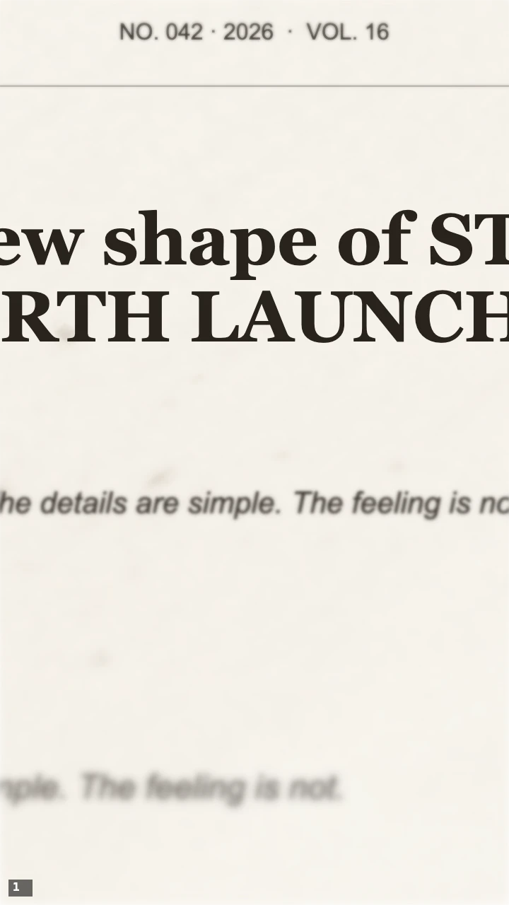
Light treatment: Large text, Soft page blur, and Dark mode off. The type is prominent, but the sides of the headline are outside the frame.
Soft blur keeps more of the page structure visible. The light palette can join a well-lit product shot or a founder introduction, but its appearance does not solve the clipped headline.
Keep Text size: Large. Change Page blur to Heavy and turn Dark mode on. Leave the headline unchanged.
Do not choose Regenerate variation while comparing these settings. Regenerating changes the page sequence too, which introduces another difference. First compare the same sequence under the two treatments; explore a new variation after choosing a direction.
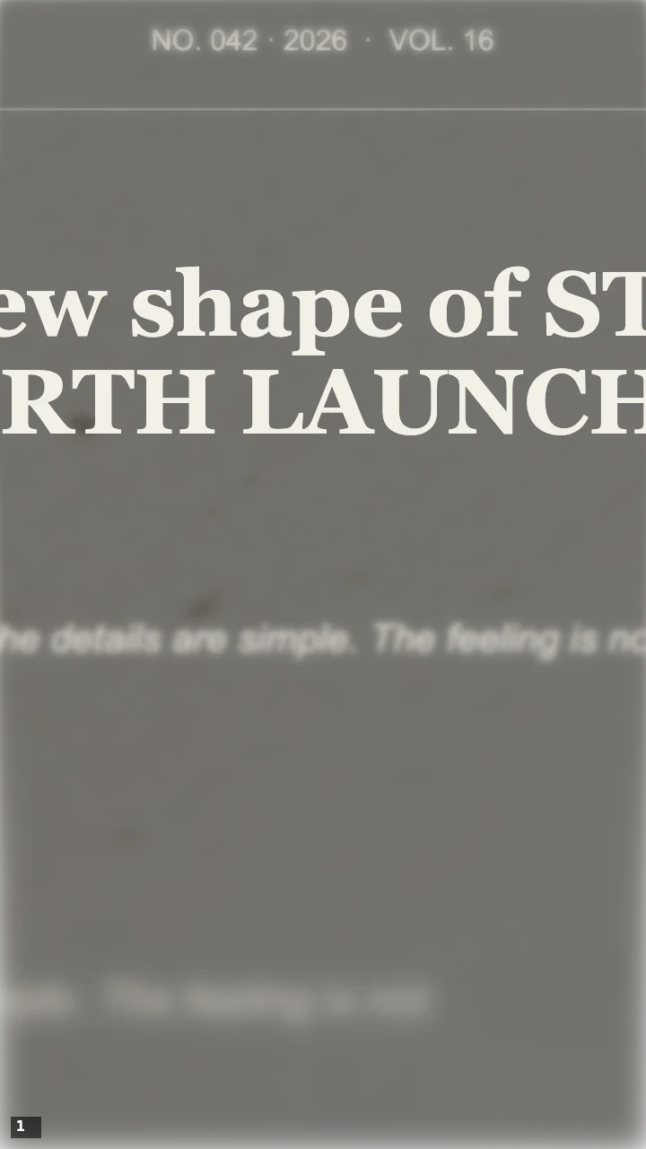
Darker treatment: Large text, Heavy page blur, and Dark mode on. Changing contrast and blur leaves the framing problem in place.
The darker version is useful when the next shot is also dark or high contrast. Heavy blur pushes secondary page detail further away from the headline. It changes emphasis, not the pace or the headline's framing. Changing the background treatment cannot rescue words that are outside the output frame.
Fix the framing and keep one announcement readable
In the first captured page, Large shows only fragments of the phrase: the beginning and end run beyond the 720-pixel-wide canvas. Text size changes the camera framing as well as the apparent type scale. Reducing it to Small made more of STUDIO NORTH LAUNCHES visible, but part of STUDIO still fell outside the frame. Size alone did not fix this input.
For the revised example, shorten the text to NORTH LAUNCH and choose Generate. Set Text size: Small, Page blur: Soft, and Dark mode: Off. The captured page now shows both words. Changing the input also changes the generated page composition: the pink FORME-style page below is a different design from the earlier white page. Compare this as a practical correction rather than attributing the improvement or the color change to one control.
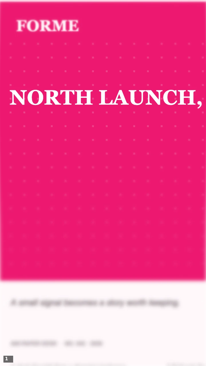
Revised input: NORTH LAUNCH, Small text, Soft page blur, and Dark mode off. Both words fit in this captured page. Check the remaining page beats before choosing the final variation.
Even the original three-word statement was too wide in this layout. Keep the animation's job focused: a launch, a release, a name, or a short announcement. Put dates, availability, pricing, and a call to action on the next shot where viewers have time to read them.
Preview once without pausing, at about the size of a phone screen. Then pause several different page beats. Check that the exact announcement survives the changing layouts, rather than judging readability from the clearest still alone.
If the headline feels crowded, first remove words that belong in the following explanation. For example, STUDIO NORTH LAUNCHES A COLLECTION asks the opener to carry more information; NORTH LAUNCH leaves the collection details for a product shot and a separate release card. The editor accepts up to 40 English graphemes, but that limit is not a target length or a guarantee that every phrase fits every layout.
If the surrounding page distracts, increase Page blur before making the headline longer or adding more claims. If the dark version feels visually disconnected from the next shot, return Dark mode to off. Choose the setting that joins the edit, rather than assuming that a heavier treatment always makes a stronger announcement.
Use the editorial look honestly
This effect creates publication-style compositions around the text you enter. Supporting text and page layouts are design material; they do not verify the statement. Keep the visual attached to an announcement you can substantiate, and avoid presenting it as a record of independent coverage.
For a real press roundup, show actual headlines, publication names, links, and permissions in the surrounding project as appropriate. A generated opener can introduce that section, but it cannot replace its sources. For a fictional project such as this example, label it clearly when sharing outside the editing context.
Export and place the opener
The default sequence exports as a silent, 720 × 1280 vertical clip. The tested Video (MP4) is 2.5 seconds at 30 fps. GIF samples at 8 fps; the tested 20-frame file lasts 2.6 seconds because GIF frame delays are rounded. Use MP4 when the clip needs to land precisely on a video timeline. Add voiceover, music, or a sound cue in your video editor; this export does not supply an audio track.
Cut from the repeated announcement to a shot that answers it: the product, the person behind the launch, or the release details. Watch the transition at normal speed and on a phone. The opener has done its job when the viewer knows what is launching and the next shot adds something new.
When the product image should lead instead of the announcement, use the Paper Fold full-image and cutout comparison. Return to all practical guides for other editing tasks.