
Magazine Letters: Make a Readable Three-Word Title
Build a three-word cutout title and compare letter size, palette, and spacing before checking the result on a small screen.
Last updated:
By: Ani Paper
A cutout title has several jobs at once: each letter needs to look different, the words need to stay together, and the phrase still has to read quickly. MAKE SOME NOISE is a useful test because its three short words can work as a music opener, event title, or energetic intertitle without requiring a paragraph of explanation.
This walkthrough compares a medium, blue-toned treatment with a larger, tightly spaced color treatment. The goal is to make an intentional title, then check the letters across the moving sequence rather than approve one attractive still.
Make a restrained first version
Open the Magazine Letters editor, type MAKE SOME NOISE, and select Generate. Enter the text on one line with normal spaces. The editor lays out and wraps the individual letters automatically; it does not offer manual placement or line-break control.
Set Letter scale to Medium, Palette to Cobalt, and Tile spacing to Balanced. This is a baseline to test, rather than a guarantee of clear lettering. The mixed type widths, tilted scraps, and color combinations can make the same phrase behave differently across the sequence.
Play the sequence once. Concentrate on word recognition first: can you read all three words without mentally reassembling the title? Then watch again for the paper character. The changing fonts, rotation, and tile shapes already supply variation, so the palette does not have to do all the work.
Try the larger, tighter alternative
Keep MAKE SOME NOISE unchanged. Set Letter scale to Large, Palette to Candy, and Tile spacing to Tight. Leave the variation unchanged while comparing the versions.
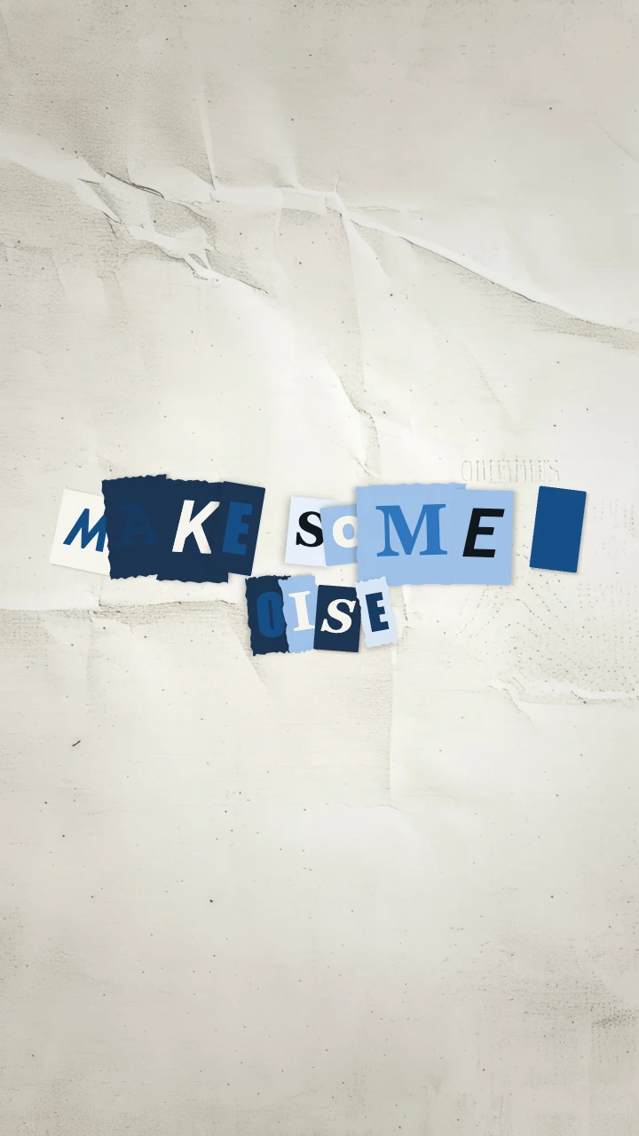
Medium · Cobalt · Balanced
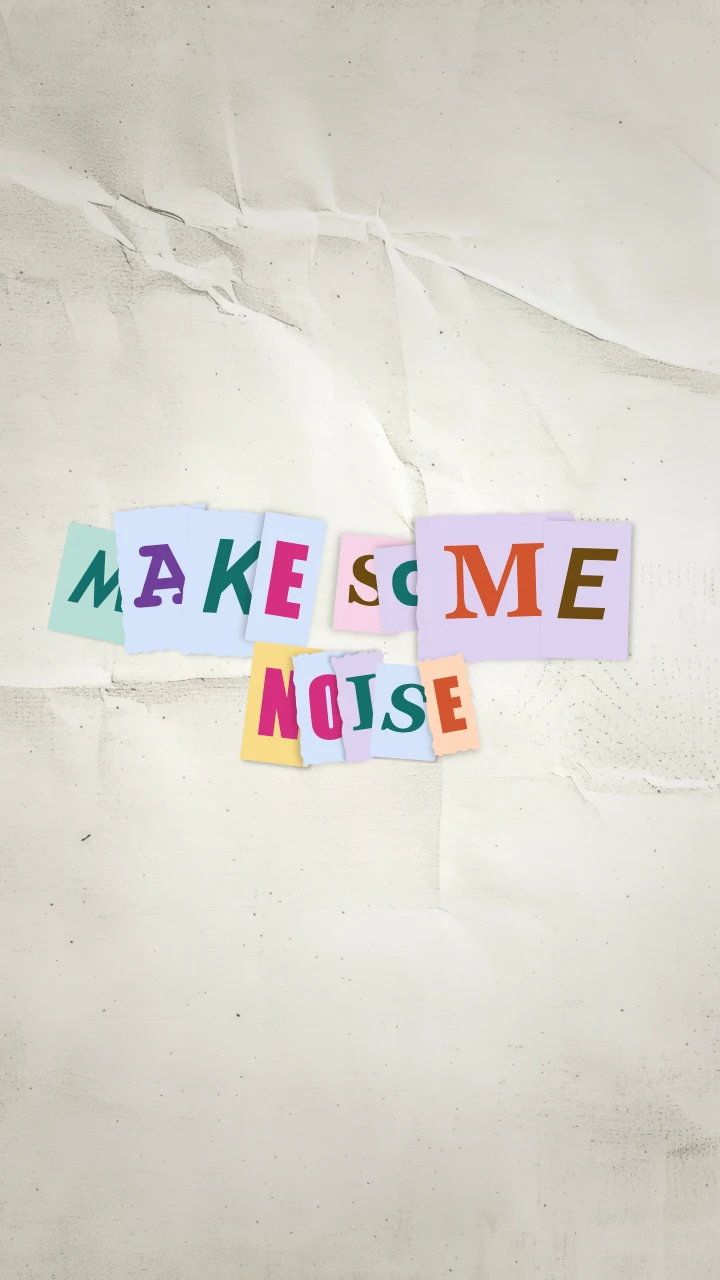
Large · Candy · Tight
The frames above show real failures to look for. In the Cobalt capture, the dark A has weak contrast against its dark tile, and NOISE splits across two rows: N ends the first row while OISE starts the next. In the Candy capture, NOISE stays together on the second row, but neighboring paper tiles still partly obscure letters in SOME. Bigger letters did not simply make every part of the title easier to read.
Look at the gaps between tiles and the boundaries between words, not just the overall color. Large letters have larger paper tiles as well as larger glyphs. Tight spacing reduces the space between their centers, so the title can become more crowded even though the letters themselves are bigger.
Color and spacing solve different problems. Cobalt keeps the title within a family of blue, pale, and dark paper colors. Candy introduces more hues. Neither palette guarantees that every randomly paired letter and tile will be equally easy to read; check the entire sequence before exporting.
Refine the title without adding words
For the correction below, keep MAKE SOME NOISE and use Medium / Candy / Airy. This returns the tiles to the smaller of the two sizes already tested and adds more space between them. Keep the original variation; this example did not need regeneration.
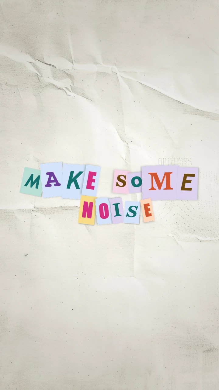
Medium · Candy · Airy: the corrected title keeps all three words visible.
In this capture, MAKE and SOME stay on the first row and the complete word NOISE occupies the second. All the letter faces can be seen. Some paper edges still overlap, which preserves the cutout character without hiding the glyphs. This is the useful distinction: overlapping paper can look intentional; an obscured letter changes the message.
Treat this as a tested starting point for this phrase. Different words have different widths, and another arrangement can still need adjustment. The next check is the complete moving sequence.
Inspect more than the first sheet
The default animation changes through 20 paper arrangements over 2.5 seconds, with each arrangement held for about 125 milliseconds. Fonts and tile treatments vary from one arrangement to another. A clean opening frame therefore does not establish that the whole title is clear.
Use playback to judge the overall reading rhythm, then use the preview's frame controls to inspect crowded arrangements. On a phone, check at the normal display size rather than zooming into the title. The downloaded canvas is 720 × 1280; viewing it at a 360-pixel width halves the apparent size of all the letter details.
Pay particular attention to SOME NOISE. Narrow and wide glyphs do not occupy equal space, and wrapping can change as their type treatments change. If a word breaks awkwardly, reducing Letter scale or shortening the phrase is more reliable than trying to force a particular manual line break.
Fix a title that looks lively but reads poorly
- Tiles crowd or overlap: return Tile spacing to Balanced. If the title is still dense, reduce Letter scale to Medium before adding more words.
- The title breaks in an awkward place: try shorter copy such as
MAKE NOISE. Automatic wrapping is part of this tool; move a subtitle or event date into a separate caption in your video editor. - A letter blends into its paper tile: preview another arrangement or use Regenerate variation, then inspect again. A different palette can help the overall mood, but it is not a substitute for checking contrast on the actual letters.
- The message needs a date, place, and call to action: keep this animation for the title. Put the practical details on a stable end card with consistent typography.
The English text limit is 32 visible text units, including spaces. A three-word title uses the available area more effectively than filling that limit with a sentence. Punctuation is part of the composition too: an extra exclamation mark becomes another tile competing for room.
Use the title as one beat in the finished video
For a music or event edit, place the title after a short establishing shot and cut from its final paper change to the main action. You can add a paper rustle or a short impact sound on your own timeline, but the downloaded animation itself is silent. Leave event details on screen long enough to read outside this fast title sequence.
Export Video (MP4) for a normal video edit. The example download was 2.5 seconds, with 75 H.264 video frames at 30 fps, a 720 × 1280 vertical canvas, and no audio track. Those video frames hold the paper arrangements within the timeline; they do not add new paper arrangements between the existing beats. The browser needs WebCodecs and H.264 encoding support for MP4 export.
Choose GIF when the destination accepts a looping image. It samples at approximately 8 fps on the same canvas and reduces the colors for the format. The GIF from this example contained 20 image frames over 2.6 seconds, slightly longer than the MP4 because GIF frame delays are rounded. Check the downloaded GIF for letter edges and color changes before placing it on a page. Add audio, final captions, and any duration changes in your editing app.
If the exact phrase needs to remain steadier across the transition, try Text Match Cut. If the title announces a product release rather than an event, the Press Coverage launch walkthrough offers a more editorial treatment.