
Paper Animation for Short-Form Video: A Practical Guide
Choose a paper animation effect, keep text readable, and export a useful vertical clip without overcomplicating the edit.
Last updated: 2026-10-15
By: Ani Paper
Paper animation works best as a short visual beat: an opening hook, a title, a reveal, or a transition. The paper texture gives a still image or phrase physical character, but the effect still needs to serve the edit. Start by deciding what the viewer should notice, then choose the simplest motion that makes that moment clear.
Choose the effect by source and purpose
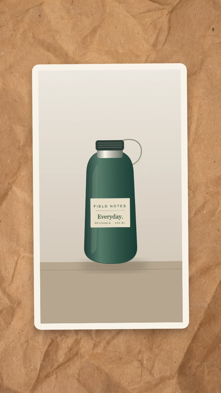
- One clear photo → Paper Fold. Use it to reveal a person, product, place, or artwork.
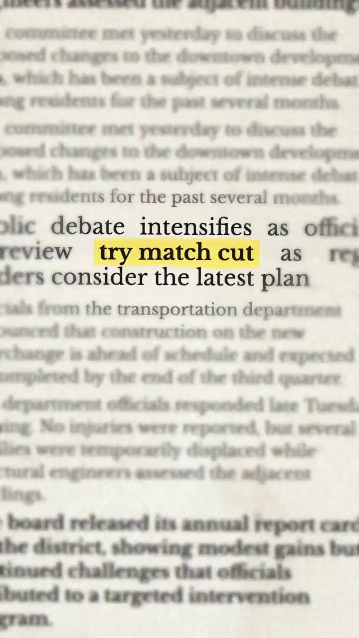
- One key word or short phrase → Text Match Cut. Use it to anchor a hook, statistic, name, or claim across changing frames.
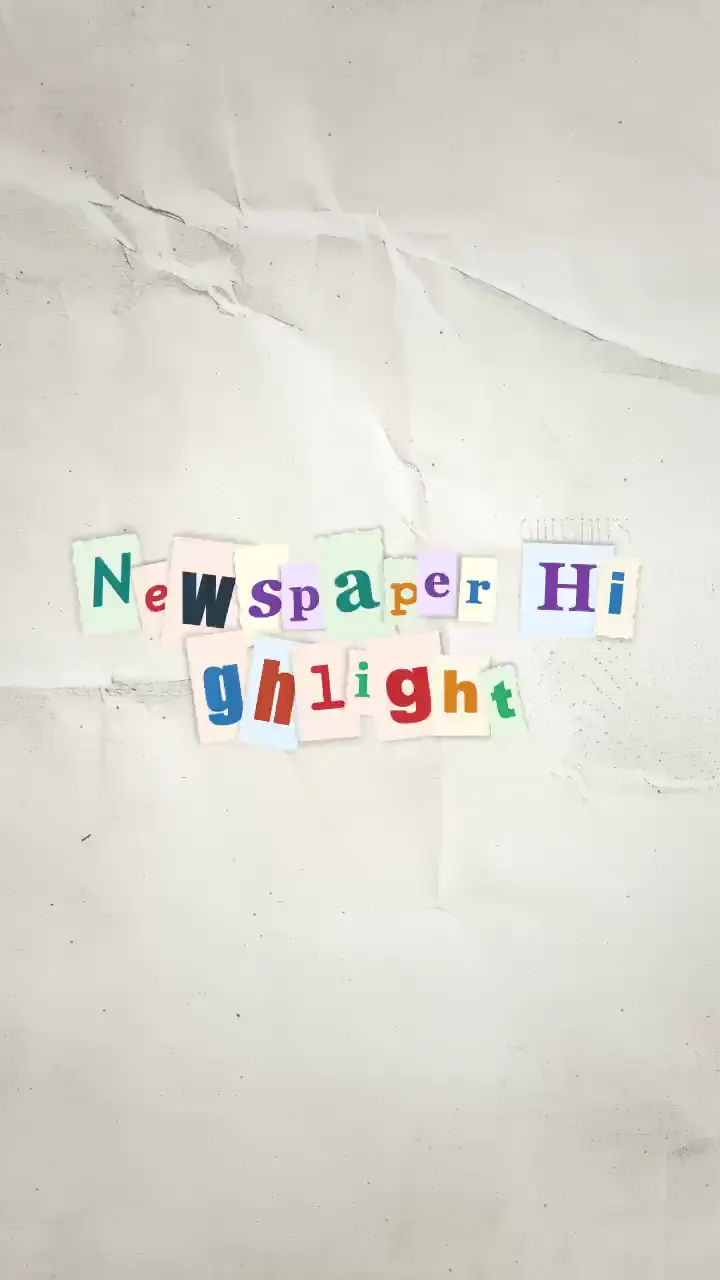
- A playful title → Magazine Letters. Use it for music, fashion, invitations, punchlines, and handmade title cards.
- A launch or announcement → Press Coverage. Use it to move one story across different editorial front pages.
Do not choose an effect only because it looks busy. A fold is useful when the image is the subject. A text match cut is useful when the exact phrase must remain readable. Magazine letters add personality but need short copy. Press coverage creates scale, so it fits announcements better than quiet personal captions.
Keep the input easy to read
For Paper Fold, begin with an image that has one obvious subject and enough empty space around it. Subject selection runs on your device, but a clean silhouette still produces a clearer fold than a crowded group photo. If the cutout is uncertain, animate the full image instead of forcing a weak mask.
For text effects, shorter is usually stronger. Treat the animated phrase like a title, not a paragraph. Newspaper and match-cut frames support up to 40 English graphemes, while Magazine Letters supports up to 32, but the maximum is not always the most readable choice. Preview the result at phone size and shorten the phrase if the viewer has to pause to understand it.
Tune one quality at a time
Adjust the control that supports the intended feeling. A softer Paper Fold suits a considered portrait; a punchier unfold suits a product entrance. For a text match cut, text size protects the visual anchor, distortion adds movement, and marker roughness changes the printed character. With Magazine Letters, spacing and palette often matter more than adding more words. In Press Coverage, headline scale controls urgency while page blur keeps the story in front.
Regenerate only after the input and main settings are right. A new variation changes the composition, but it cannot rescue an unclear phrase or unsuitable image. In Newspaper Highlight and Match Cut, use Frames to change the total sequence length; regeneration keeps each layout at about 120 milliseconds.
Export for the next edit
Ani Paper exports silent vertical MP4 or GIF files. The 720 × 1280 frame is ready to place in a Reel, Short, TikTok, presentation, or larger video timeline. Keep important text away from the extreme top and bottom, where platform controls and captions may cover it. Add music, narration, captions, and final timing in your usual editor.
Before publishing, watch the clip once without sound. The subject or phrase should remain understandable, the animation should create one clear beat, and the final frame should give the next shot somewhere natural to go.
Create your first paper animation for free.
Practical guides with tested examples
Work through a specific creative task with reproducible settings, visual comparisons, and fixes for common failures.
- Paper Fold Product Reveals: Full Image or Subject Cutout?
Compare a full-image reveal and a subject cutout using the same product illustration, then learn when an uncertain edge makes the full image a better choice.
- Readable Newspaper Highlights: Numbers, Phrases, and Phone Previews
Test text size, distortion, and marker roughness on the same newspaper highlight, with phone-size previews that show where readability breaks down.
- Text Match Cut Timing: Comparing 4, 12, and 20 Frames
Keep one phrase fixed and compare 4, 12, and 20 newspaper frames to choose a useful duration and transition rhythm for your next edit.
- Magazine Letters: Make a Readable Three-Word Title
Build a three-word cutout title and compare letter size, palette, and spacing before checking the result on a small screen.
- Press Coverage: Build a Product Launch Opener
Turn a product announcement into an editorial opener and compare headline size, page blur, and light or dark backgrounds.