
Readable Newspaper Highlights: Numbers, Phrases, and Phone Previews
Test text size, distortion, and marker roughness on the same newspaper highlight, with phone-size previews that show where readability breaks down.
Last updated:
By: Ani Paper
A newspaper effect can make a number look important while making the number itself harder to read. The useful test is whether a viewer can recognize the highlighted phrase as the surrounding page changes. This walkthrough uses 42% LESS WASTE to compare a clear treatment with a busier one, then checks the result at phone size.
The number is fictional demonstration copy. Replace it with a claim you can substantiate before using the clip in an advertisement, product page, or report. The generated newspaper text is decorative context, not a source for the claim.
Build the readable version first
Open the Newspaper Highlight editor, enter 42% LESS WASTE, and select Generate. Keep the whole phrase together: the number without its qualifier would leave the viewer guessing what changed.
Use these settings for the first version:
- Text size: 60px. This is the upper end of the current control. A short phrase gives the highlighted text more room than a full sentence.
- Distortion: 2. Keep the printed page treatment restrained while you assess the words.
- Highlight roughness: 15%. Start with a relatively neat marker shape.
- Under More settings, leave Frames: 20 for the full 2.4-second sequence.
Play the preview after the settings finish preparing. Read the phrase once, then watch the surrounding page. Your attention should return to the highlighted words without having to find them again on every change. The editor can reduce the rendered font size to fit a long phrase, so a 60px setting is not a guarantee that every input will appear equally large.
Compare it with a busier treatment
Keep the exact same phrase and change Text size to 30px, Distortion to 18, and Highlight roughness to 90%. Do not regenerate the variation between the two versions. That keeps the comparison focused on the controls rather than on a different set of page layouts.
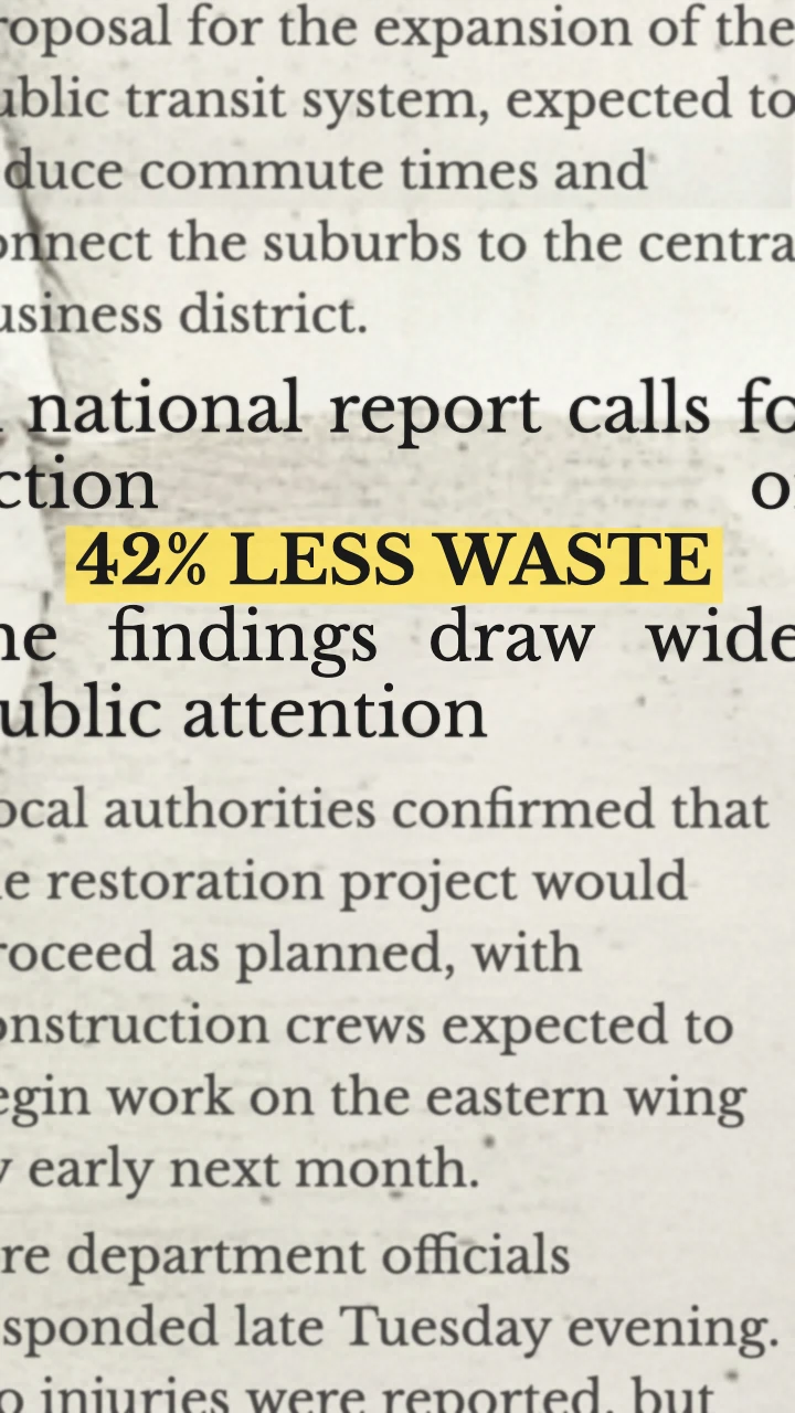
60px · distortion 2 · roughness 15%
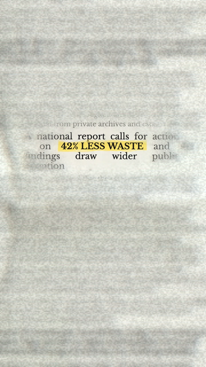
30px · distortion 18 · roughness 90%
These are frames captured from the editor, rather than photographs of a real newspaper. In the first capture, the phrase spans most of the frame width and all its words remain inside the canvas. In the second, the same phrase occupies a much smaller central area, surrounded by a hazier, grainier page. Both retain the full phrase, but the smaller treatment asks the viewer to read finer type.
This compares two complete treatments, not an isolated test of one slider. Change one control at a time afterward to find the part you prefer. A still frame shows the lettering; playback is needed to judge how easily the phrase survives repeated layout changes.
The busier settings are a useful stress test, not a rule that texture is always wrong. Small type can suit a fleeting visual insert when the message has already been spoken. It is a weaker choice when this clip is the first place the audience encounters the number.
Check at the size the audience will see
Preview the clip on a phone or reduce the video in your editing timeline until its displayed width is roughly 360 pixels. The export is 720 pixels wide, so this makes the lettering appear about half its exported pixel size. A desktop preview enlarged to fill a window can hide a readability problem.
Watch once without pausing. Ask a second person to repeat the number and the phrase after one viewing, if possible. If they remember “42%” but miss “less waste,” shorten other copy around the clip or give the phrase a quiet hold before or after the animation. Enlarging the surrounding video in the timeline may crop the newspaper without making the entire phrase easier to read.
Keep your source, comparison period, and explanation in a normal caption or the next shot. The moving newspaper background should not carry details that viewers must study.
Fix the specific failure
- The phrase becomes smaller even at 60px: shorten it.
42% LESS WASTEis a title-sized statement;OUR NEW PROCESS PRODUCES 42% LESS WASTEspends the available width on an explanation. - The marker fights the letters: reduce Highlight roughness before changing the palette of the whole edit. You can preserve a printed look without maximizing the marker texture.
- The number is readable only when paused: use the larger text treatment and add a static caption or hold in your video editor. Adding more page changes does not give each layout a longer hold.
- A frame looks like independent news coverage: describe the animation as an illustration and show the real source separately. Decorative typesetting is not evidence that a publication covered your story.
Export and place it in an edit
Choose Export → Video (MP4) for a video timeline, or GIF for a looping image placement. Both use a fixed 720 × 1280 vertical canvas. The MP4 downloaded for this example was 2.4 seconds, with H.264 video at 30 fps and no audio track. The corresponding GIF contained 19 frames over 2.47 seconds: GIF samples at approximately 8 fps, then rounds its frame delays. It also uses a limited color palette, so use the downloaded GIF itself when checking marker edges.
Exports are silent. Add narration or music in your editing app. The editor checks local MP4 encoding support before export; if MP4 is unavailable, export a GIF or use a browser that supports the required WebCodecs/H.264 configuration.
For a data-led edit, put the clip after a spoken setup, then cut to the source or product footage that explains the number. If your main problem is choosing the length of the transition, use the 4-, 12-, and 20-frame Match Cut comparison. For an announcement that needs a front-page headline instead of a highlighted line, try Press Coverage.